Article 2 of the Heatwaves series | HansOnResilience.com — Hans Guttman | July 2026
In brief:
A heat index built for Finland will not save lives in coastal Pakistan — human heat tolerance, humidity regimes, and vulnerability all vary by place, so a single global threshold can’t work. This piece sets out what a localised heat index actually requires: which variables matter, how to weight them for a given population, and why localisation needs to become a standardised process, rather than a one-off analytical exercise done differently by every project that attempts it.
Article 1 of this series established something uncomfortable: heat is one of the deadliest natural hazards on the planet, yet it is a major hazard without a standardised, operationally useful definition. That article made the case for why a definition matters — the threshold, the protocol, the action. This article tries to answer the harder question that follows immediately from it. A definition of what, exactly?
The moment you sit down to answer that, you run into a split that has divided the institutions working on this for more than twenty years. The World Health Organisation (WHO) looked at heatwaves and saw a public health emergency — a medical event requiring clinical response, hospital preparedness, and protection of the physiologically vulnerable. The World Meteorological Organisation (WMO) looked at the same phenomenon and saw a meteorological hazard — an atmospheric condition with measurable properties, requiring a measurement framework that could function independently of any single sector’s impact. Both were right. But they built different frameworks; they answered to different constituencies, and the practitioner in the field — the emergency manager, the agricultural extension officer, the city planner — has been caught between them ever since.
Getting this right matters for more than tidiness. A definition built only for the health sector leaves agriculture, energy, transport, and labour exposed without actionable warnings. A purely meteorological measure risks losing the human dimension that makes the political case for action. The challenge is to build something that is physically grounded, locally calibrated, and genuinely usable across sectors. That is what this article explores.
Two starting points, one hazard
The health-first approach has deep roots and genuine achievements. As mentioned in the earlier article the catastrophic 2003 European heatwave killed an estimated 70,000 people, and the response was led primarily by public health authorities. Hospitals developed registers of vulnerable patients. Social services launched outreach programmes. France’s Plan National Canicule established tiered alert levels linked to temperature thresholds calibrated against observed mortality data. The 2015 joint WMO/WHO guidance on Heat-Health Warning Systems formalised this approach internationally, framing a heatwave principally in terms of its effect on human health. The subsequent WHO/Europe guidance, updated in June 2026, continues in this tradition.
This approach has demonstrably saved lives. It connected meteorological forecasts to health system preparedness in a way that was not present before 2003. But it carries a structural limitation: it defines the hazard by its effect on one receptor — the human body — and leaves other sectors to “fend for themselves”. An agricultural extension service, an energy grid operator, a transport authority: none of them appear in the health-centric framework except as indirect beneficiaries of a warning primarily designed for hospital administrators.
The WMO approach, articulated most clearly by John Nairn, takes a different starting point. John is WMO’s Senior Extreme Heat Advisor and co-developer of the Excess Heat Factor (EHF). In his words, a heatwave should be thought of the way we think about wind: “there’s a lot of low intensity heat where we are very capable of managing it, but once we reach an intensity that’s dangerous we may find that vulnerable people need a warning… and as that intensity goes up we may get to a level where our infrastructure is starting to be impacted or healthy people need to take more protective action.” The definition, in this framing, describes the meteorological hazard — the atmospheric condition — and leaves each sector to derive its own response from that shared signal. This is precisely how impact-based forecasting is supposed to work in other hazard domains.
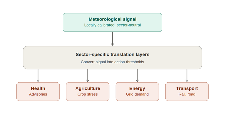
Neither approach is wrong. The disagreement is about where the definition sits in the chain from observation to action. The health approach anchors the definition to the impact; the meteorological approach anchors it to the hazard. The practical challenge is to combine them — a meteorological signal that is locally calibrated and sector-neutral, with sector-specific translation layers that convert that signal into action thresholds relevant to health, agriculture, energy, or transport. The rest of this article works through what that means in practice.
A heatwave is not a temperature reading — it is a sequence
Here is the most important single insight in the measurement debate, and it comes directly from Nairn’s framework: a heatwave is not defined by a temperature reading at a moment in time. It is defined by a sequence — a progression through time — in which the critical variable is the inability of the system to recover between episodes of heat.
Think of it this way. Consider a typhoon forming in the Western Pacific. When it is far from land, it is tracked, categorised, and monitored — but no emergency response is triggered. As it intensifies and its track narrows toward a coastline, the category rises, and warnings escalate. The typhoon moves through space toward a point of impact. A heatwave is structurally analogous, but it moves through time rather than space. Each day of excess heat is a step closer to impact. The question is not where the heat is — it is how long the heat has been building and whether the system has been able to discharge/reset it.
The mechanism is the overnight minimum temperature. If a very hot day is followed by a cool enough night, the environment — buildings, soil, the urban fabric, and critically the human body — can shed the heat accumulated during the day. The system resets. But when a hot day is followed by a warm night, that discharge/reset does not happen. The heat load carries forward, adding to the next day’s accumulation. Nairn describes this as a “staircase” effect: each warm night adds another step, the total heat burden rises, and the system’s capacity to cope progressively erodes. The January 2026 Global Heat Health Information Network (GHHIN) article, written by Nairn, puts it precisely: “if a hot day is followed by a warm night, the system cannot fully shed that energy. The heat begins to accumulate, building day after day. This failure to recover is the defining characteristic of a heatwave.”
This insight has a critical operational implication that a simple temperature threshold entirely misses. Two locations can experience identical daytime temperatures but very different heatwave risk — because one has cool nights that allow “recovery” and the other does not. A coastal city in Southeast Asia at 36°C with a night minimum of 30°C is in a fundamentally more dangerous position than an inland location at 38°C with a night minimum of 20°C, even though the inland maximum is higher. Daytime temperature alone, which is what most current warning systems track most closely, does not capture this. The overnight minimum must be in the definition.
There is a further dimension that temperature alone cannot capture: the relationship between today’s heat and what is locally normal. Thirty degrees Celsius triggered a record-breaking heatwave in parts of Norway and Sweden in the summer of 2025. Thirty-two degrees is an ordinary Tuesday in Kuala Lumpur, Malaysia. What matters is not the absolute temperature but how far above what the local population, infrastructure, and ecosystems are acclimatised to. A threshold set at the 95th percentile of the local long-term temperature distribution captures this automatically — it is extreme relative to local experience, the top 5% of heat events, which is exactly what drives heat stress. This is the EHF’s first component: the excess heat index for significance (EHI~sig~), comparing the three-day mean temperature to that local 95th percentile baseline. When the three-day mean exceeds it, EHI~sig~ turns positive.
The second component, the excess heat index for acclimatisation (EHI~accl~), compares the same three-day mean against the preceding thirty days — capturing whether the body and environment have had time to adjust, not whether last night offered thermal recovery.
Combining departure from local extremes (EHI~sig~) with failure to acclimatise (EHI~accl~) gives the EHF its logical structure. Positive EHF means both conditions hold at once. Rising EHF means the combined stress is intensifying. Crossing the 85th percentile of local EHF values means it has reached severe territory. The metric works as both a definition and a forecast tool, since it runs on forecast data as well as observed data — delivering the same trajectory warning a typhoon track provides, but in temporal rather than spatial terms.
Four dimensions any robust definition must capture
From the logic above, a definition that can do real operational work needs to address four dimensions that a simple temperature threshold cannot handle.
Temperature relative to local norms, not absolute temperature. As established above, what constitutes extreme heat is relative to local acclimatisation. The 95th percentile (top 5%) of the local long-term temperature distribution (EHI~sig~) — typically calculated from 30 years of daily data — is the standard reference point. This ensures the definition is meaningful in context, not imported from another climate. But, as discussed in the first article, if 30 years of reliable daily data does not exist, there are other ways of obtaining a credible baseline.
The overnight minimum — the recovery dimension. The danger of a heatwave is in the accumulation, not the peak. A definition that does not include the overnight minimum will systematically underestimate risk in humid tropical environments where nights stay warm, and will fail to distinguish between a dangerous event and one that is merely uncomfortable.
Duration and accumulation. A single very hot day is a different risk from three consecutive days of moderate excess heat, even if the peak temperature is lower. The EHF framework addresses this through the three-day averaging window and the acclimatisation baseline — both designed to capture the compounding effect. Notably, Nairn and colleagues also emphasise that risk persists after temperatures drop: because of heat inertia in buildings and in the urban environment, the danger does not disappear when the thermometer falls. A definition that only identifies the onset of a heatwave, and not its tail, will cause early stand-downs that can cost lives.
Humidity. In tropical and coastal environments, high humidity suppresses evaporative cooling — the body’s primary defence against heat stress. Sweat can only cool when it evaporates, and when the surrounding air is already saturated, evaporation slows or stops. Two different metrics capture this, on two different scales. Wet-bulb temperature is a direct physical measurement of the evaporative limit; 35°C is broadly the threshold beyond which even a healthy, resting adult with water and shade faces a fatal rise in core body temperature within hours. Heat Index is a separate, empirically derived “feels like” figure, not directly comparable to wet-bulb readings — in Manila during April, a measured air temperature of 36–38°C combined with 70–73% relative humidity produces a Heat Index of 44–49°C, PAGASA’s own danger threshold. A definition relying on dry-bulb temperature alone misses both. Humidity also affects sectors reliant on evaporative cooling, such as thermal energy plants and livestock, which sweat or pant to shed heat.
One further complication deserves a flag here, even though the full implications belong to a later article in this series. Heat Index is not simply “temperature with a humidity adjustment” — it is a nonlinear joint function of both variables. Wet-bulb temperature offers a contrast worth noting here. It is a single, direct physical measurement — the temperature air reaches when cooled to saturation by evaporation.
But wet-bulb temperature is not designed to communicate effect; a wet-bulb reading of 31°C does not intuitively tell most people, or most practitioners, how dangerous that is or how much cooling capacity it leaves the body. Heat Index was deliberately built the other way around — designed to approximate perceived, “feels-like” danger on a scale people already read intuitively — but it is a combined quantity.
Finally, averaging a day’s temperature is simple arithmetic; averaging a day’s Heat Index properly requires computing it at each time humidity and temperature were jointly measured, then aggregating those values — not aggregating temperature and humidity separately and combining daily figures afterwards. Averaging a day’s wet-bulb temperature could be as simple as averaging a day’s temperature. This will be explored in a later article. Humidity is unambiguously a key factor for a genuinely rigorous humidity-inclusive EHF; which measure is practical to use, however, depends heavily on what data a given service actually has available. That practical question, and which of these two candidate measures — or others — is addressed later in this series.
Table 1: Three measurement approaches — what they capture, what they miss
| Excess Heat Factor (EHF) | Heat Index (HI) | Wet-Bulb Globe Temp (WBGT) | |
| What it measures: | Departure from local climate norms × accumulated stress over consecutive days/nights | Apparent temperature combining air temp + relative humidity | A single composite “feels-like” temperature under direct sun exposure |
| Key inputs: | Daily mean temp (max + min), 30-year baseline, 30-day rolling mean | Air temperature, relative humidity | Air temp, relative humidity, solar radiation, wind speed |
| Best suited to: | Multi-day event tracking; multi-sector hazard signal; impact-based forecasting | Public communication; daily thermal comfort; tropical/humid climates | Occupational health; outdoor worker safety; sports and military settings |
| What it misses: | Conceptual gap: does not capture humidity directly. Practical barrier: requires 30+ years of local data to establish a reliable baseline — a real constraint in data-scarce regions most exposed to heat. | Does not capture cumulative stress or nocturnal heat; no duration dimension | Complex to measure; less suited to multi-day event classification |
| In use: | Australia (national warning system); increasingly referenced by WMO for international scaling | Philippines (PAGASA); USA (NWS); widely used across South and Southeast Asia | ILO occupational heat standards; military; WHO heat stress at work guidance |
WBGT is related to but distinct from the wet-bulb temperature mentioned earlier — WBGT is a composite formula (roughly 0.7×wet-bulb + 0.2×globe + 0.1×dry-bulb) designed for occupational work/rest decisions, not a stand-in for the population mortality question the 35°C wet-bulb threshold addresses.
One signal, multiple sectors — the promise and its honest limits
The appeal of Nairn’s framework is that it aspires to be sector-neutral. An intensity-based, locally calibrated, meteorological measure of cumulative heat stress should, in principle, tell everyone — health authorities, agricultural services, energy grid operators, transport agencies — that an anomalous and worsening heat event is under way. Each sector then adds its own translation layer to derive action thresholds relevant to its particular exposure. This is precisely the logic of impact-based forecasting, which WMO has adopted as its overarching approach to hazard communication.
The key conceptual step, which is easy to state but not always easy to implement, is to separate the hazard signal from the receptor state. The meteorological measure describes what the atmosphere is doing. Whether that atmospheric condition is dangerous depends on the state of whatever is being exposed to it — and that state varies by sector, by location, and, critically, by timing.
For human health, the EHF’s statistical anomaly reliably signals real danger for a structural reason: the window of concern — summer, the hot season — is also the period when ambient temperatures are already close to the threshold at which the body’s physiological limits are tested. The 95th-percentile anomaly and the physiologically dangerous period coincide during summer/hot season because that is when conditions are warm enough for the threshold to be in play at all. This is reinforced empirically: Nairn and Fawcett derived and validated EHF’s severity bands, including the 85th-percentile “severe” threshold, directly against excess mortality and hospital admission records — health outcomes were part of how the metric was calibrated in the first place.
The same single principle governs agriculture, but it plays out differently because the window of concern is not necessarily fixed to one annual period. Rice, the staple crop for hundreds of millions across South and Southeast Asia, can flower — the stage needed to produce the grain — multiple times a year under double- or triple-cropping systems, and only some of those flowering windows happens during periods when ambient day and night temperatures are already close to the crop’s physiological threshold: spikelet sterility, causing crop failure, can begin at 33–35°C daytime during or a single night at 30°C or above during flowering can cause significant yield loss. A flowering period that occurs during a naturally cooler season is not a window of concern, however anomalous the EHF reading; a flowering period that occurs in an already-hot season is.
Unlike health, this signal for rice crop failure has not yet been empirically calibrated against outcomes at scale — no extensive body of crop-failure records matched against EHF data exists yet — but there is no structural reason it couldn’t be. The same approach that produced EHF’s mortality correlation could, in principle, produce an agricultural one, given the data.
This is what a hazard signal meeting a sector-specific receptor looks like: the same underlying test — is this anomaly occurring during a window where absolute conditions matter? — applied sector by sector. An unusually warm January week in Germany, ten degrees above normal day and night, illustrates it from the health side: EHF-positive by percentile logic, but occurring outside the window of concern as the ambient winter temperatures come anywhere near the threshold that drives mortality, so the physiological impact is minimal. It is the same test that determines whether a given rice-flowering window matters. The translation layer’s job, for any sector, is to know where its own windows of concern actually fall — and, ideally, to calibrate the signal against real outcomes once enough data exists to do so.
Transport infrastructure illustrates a different dimension of the same challenge. Road surfaces absorb solar radiation and routinely reach temperatures 20–30°C above the ambient air temperature. An air temperature of 35°C can produce a road surface temperature approaching 60°C or above, at which point bitumen begins to soften (a physical condition) and deform under heavy vehicle loads — causing rutting, edge failures, and restrictions on heavy transport. Energy infrastructure adds yet another dimension. Thermal and nuclear power plants that use evaporative cooling may face constraints when the temperature and humidity increase, reducing the cooling efficiency. If it is coupled with rising temperatures of river or lake water, which may be used for supplementary/emergency cooling, operational management changes may need to be made. More details on the different sectors’ concerns are explored in a future article.
The honest conclusion is this. The EHF and equivalent intensity-based metrics provide a great common hazard signal — locally calibrated, capturing accumulation and overnight recovery, more correlated with multi-sector impacts than any single threshold. But they are a starting point for each sector, not a complete answer. Each sector needs a translation layer that converts the meteorological signal into sector-relevant “windows” of concern, thresholds and action triggers. This is not a failure of the approach. It is how impact-based forecasting is designed to work. The meteorological signal tells you the hazard is building. The sector-specific translation tells you what that means for your particular receptor, at this particular moment, in this particular place.
What the institutions have built — and where the gap remains
Before describing what a localisation process may look like, it is worth being precise about what the international institutional frameworks have and have not provided — because there is a risk of either over-crediting or unfairly dismissing what has been achieved.
The Early Warnings for All (EW4All) initiative, launched in 2022 under the UN Secretary-General’s mandate, provides the overarching multi-hazard early warning architecture. Its four pillars are led by UNDRR (disaster risk knowledge), WMO (detection, observation, monitoring, and forecasting), ITU (warning dissemination), and IFRC (preparedness and response). Heatwaves sit within WMO’s Pillar 2, as one hazard among many. The framework is ambitious and structurally sound. It correctly identifies that early warning systems must be end-to-end — from observation to action — and that national ownership is essential for sustainability.
Running in parallel — and this is a distinction that is often blurred in public communications — is a separate WMO/WHO joint workstream specifically focused on Heat-Health Warning Systems, National Heat Action Plans, and Extreme Heat Risk Governance. WHO is not a pillar lead in EW4All, but it is a co-manager of this heat-health track, which produced the 2015 joint guidance, the GHHIN network, and the 2026 WHO/Europe Action Plans update. The UNDRR/WMO/GHHIN/Duke Extreme Heat Risk Governance Framework, launched at COP30 in November 2025, operates in a third lane — focused on governance maturity and institutional coordination.
These three architectures are meant to be complementary. In practice, from the perspective of a national meteorological service director, a ministry of health official, or an agricultural extension coordinator trying to build a locally-calibrated heat warning system, the picture is complex.
WMO is working toward this. Its stated intention is to develop standardised terminology and definitions for extreme heat, with harmonised approaches to heatwave intensity categorisation that will support impact-based forecasting across sectors. That work is under way and is the right direction. But intention is not yet delivery — the harmonised categorisation does not exist yet, and until it does, national services are left to define severity on their own terms.
BOX 1: The institutional architecture — a brief map
Three overlapping but distinct frameworks address heatwave governance internationally. Understanding which does what matters for anyone trying to navigate the space.
EW4All (Early Warnings for All) — the multi-hazard early warning initiative co-led by WMO and UNDRR, with ITU and IFRC leading dissemination and preparedness pillars respectively. Heatwaves sit within WMO’s observation and forecasting pillar. Focused on building national early warning system capacity broadly. WHO is not a pillar lead. Target: universal coverage by 2027. Constraint: national ownership model requires countries to resource implementation.
WMO/WHO joint heat-health track — a separate workstream producing Heat-Health Warning Systems guidance (2015), GHHIN, and the 2026 WHO/Europe Heat-Health Action Plans update. Strongly health-sector oriented. Does not formally address agriculture, energy, transport, or labour as primary sectors.
UNDRR/WMO/GHHIN/Duke Extreme Heat Risk Governance Framework — launched at COP30, November 2025, as the product of the UN Secretary-General’s Call to Action on Extreme Heat. Focuses on governance maturity assessment and institutional coordination. Pilot implementation in Barbados, Senegal, and Cambodia in 2026.
The gap: None of these frameworks has yet produced an accessible, step-by-step operational methodology for deriving a locally calibrated, sector-validated heat threshold from available national data. That is what this article series is attempting to contribute.
A standardised localisation process — the outline
What could a practical localisation process actually look like? The detail belongs to Article 3 of this series, but the logic can be outlined here in three steps that draw directly on what the measurement frameworks discussed above make possible.
Step 1: Establish the meteorological baseline. A national meteorological or hydrological service ideally needs 30 years of daily temperature data — maximum and minimum — for stations or grid points covering the area in question. From this, the 95th percentile of the local temperature distribution and the long-term daily mean can be calculated, providing the reference baseline against which anomalies are measured. Where relative humidity records are available, and tropical conditions prevail, the Heat Index or wet-bulb temperature should be incorporated into the baseline calculation. Where data sets are shorter, sparse or of uncertain quality, different tools can be used to produce a usable data set, including satellite-derived temperature products supplementing ground-based records, which may introduce additional uncertainty that should be documented. This step is technically achievable in most countries — the data generally exists in national archives. The constraint is the extent of geographical coverage, analytical capacity and the time and resources to do the work systematically.
Step 2: Validate the threshold against local impact data and identify the sector’s windows of concern. A threshold derived from meteorological data alone is a hypothesis. It needs to be tested against observed impacts to verify that it actually predicts stress in the local context — and, for sectors where the vulnerable period isn’t fixed to one calendar season, to establish when the anomaly matters at all.
As established above, health’s window of concern is fixed to summer, or the hot season, so validation mainly means comparing positive EHF periods against excess mortality records, hospital admissions, or emergency call volumes to confirm and calibrate a window that is already known. Agriculture’s window of concern, by contrast, must be identified case by case: with rice flowering multiple times a year under double- or triple-cropping systems, validation means comparing high-temperature episodes against crop yield and phenological records to establish which flowering periods actually coincide with already-warm conditions — genuine windows of concern — and which fall in naturally cooler periods and are not.
This cross-validation step is where the meteorological framework and the sector-specific evidence must be integrated rather than kept in separate silos. For health risks, WHO’s health-sector evidence base and the WMO meteorological framework need to work together — not in two parallel tracks, but in one collaborative analysis, and — for sectors like agriculture where that evidence base may not exist yet — the collaboration that needs to be built from scratch (or repurpose data from other uses).
Step 3: Derive sector-specific response tiers. Once the baseline is established and validated — including, where relevant, each sector’s own windows of concern — each sector (health, agriculture, energy, transport, outdoor labour) develops its own response protocol linked to the common meteorological signal, supplemented by sector-specific threshold adjustments where the meteorological index alone is insufficient. For health, it could follow the Australian model: low-intensity EHF triggers targeted outreach to vulnerable populations; severe EHF triggers hospital preparedness protocols and cooling centre activation; extreme EHF triggers broader public warnings and potential service closures. For agriculture, the response protocol incorporates the crop calendar directly: the same EHF level triggers a different advisory depending on whether key crops are inside a genuine window of concern — flowering, with already-warm ambient conditions — or outside one entirely. For transport, road surface temperature monitoring — a function of air temperature, solar radiation, and road surface properties — provides the sector-specific signal that complements the meteorological index.
The output of this process is not a single number. It is a locally calibrated hazard signal — the meteorological baseline and intensity categories — combined with a set of sector-specific translation documents that tell each sector what the signal means for them, when it applies, and what to do about it. No current international framework has produced this combination yet, though WMO’s impact-based forecasting approach is, in principle, designed to enable exactly this. What is missing is not the concept — the concept is sound and already agreed. What is missing is the repeatable, step-by-step process that lets a national service actually build it, using its own data, for its own context.
What this series will do next
This article has mapped the measurement challenge and outlined the logic of a localisation process. Article 3 will take this into the operational detail: what data do you need, and what you do when records are incomplete? How do you calibrate a threshold in a data-sparse environment? How do you build the sector partnerships that make the translation layers work? And what does a functional, locally-built heat early warning system actually look like in a country that has not yet built one?
The core argument of this article can be stated simply. A heatwave is not a temperature reading; it is a sequence — a temporal progression of cumulative heat stress that the atmosphere passes through, just as a typhoon passes through space toward a coastline. Measuring that sequence requires at minimum four variables: local temperature norms, overnight recovery, duration, and humidity. The EHF framework captures most of this better than existing alternatives. But a meteorological signal, however well-designed, is the beginning of a sector-specific response, not the end of it. Each sector needs a translation layer — a set of locally validated, sector-relevant thresholds and action triggers that converts the common hazard signal into decisions. Building those translation layers, systematically, using available data, through a process that is repeatable and comparable across countries, is the unfinished work. The frameworks exist. The intention is clear. The instruction manual is what is missing, and that is what this series is trying to help write.
References
Nairn, J.R. and Fawcett, R.J.B. (2015) ‘The Excess Heat Factor: A Metric for Heatwave Intensity and Its Use in Classifying Heatwave Severity’, International Journal of Environmental Research and Public Health, 12(1), pp. 227–253.
Nairn, J.R. and Fawcett, R.J.B. (2013) Defining Heatwaves: Heatwaves Defined as a Heat Impact Event Servicing All Community and Business Sectors in Australia. CAWCR Technical Report No. 060. Melbourne: Bureau of Meteorology.
Nairn, J. (2026) ‘Understanding Heatwaves: Beyond Extreme Temperatures’, Global Heat Health Information Network, 29 January 2026.
Nairn, J. (2023) ‘WMO’s Heat Expert John Nairn Explains Why It’s Important to Understand Heatwave Intensity’, World Meteorological Organization .
World Meteorological Organization and World Health Organization (WMO/WHO) (2015) Heatwaves and Health: Guidance on Warning-System Development. Geneva: WMO.
World Health Organization Regional Office for Europe (2026) Heat–Health Action Plans Guidance, 2nd edn. Copenhagen: WHO Europe.
UNDRR, WMO, Global Heat Health Information Network and Duke University (2025) Extreme Heat Risk Governance Framework and Toolkit. Launched at COP30, Belém, Brazil, 11 November 2025.
McGregor, G. et al. (2025) ‘Untangling the Fragmented Landscape of Extreme Heat Services and Warning Systems’, Environmental Research Letters.
Food and Agriculture Organization and World Meteorological Organization (FAO/WMO) (2026) Extreme Heat and Agriculture. Rome/Geneva: FAO/WMO.
Jagadish, S.V.K. et al. (2007) ‘High Temperature Stress and Spikelet Fertility in Rice (Oryza sativa L.)’, Journal of Experimental Botany, 58(7), pp. 1627–1635.
Shi, W. et al. (2016) ‘Short-Term High Nighttime Temperatures Pose an Emerging Risk to Rice Grain Failure’, Field Crops Research, 200, pp. 35–43.
Frontiers in Plant Science (2022) ‘Potential Roles of Stigma Exsertion on Spikelet Fertility in Rice Under Heat Stress’.
WMO Early Warnings for All Initiative. Global Heat Health Information Network (GHHIN). Understanding Heat.